Chart - Multi Series |
The Multi series Chart control is used to display data from different categories that are related and need to be presented on the same chart area. As the data series are related, placing them together provides a consolidated and comparative view to the user.
This topic describes the various properties and events available on the property sheet, which can be customized to present this type of chart. If you are using a model that is bound to this chart control, you can use the Message Map to map the information to be rendered as a chart. The mapping that you define between the control and the model is stored in a mapping object. Alternatively, if no model is used, you can use the setChartData()method to set data for the Chart control.
For details about the behavior and functionality of the chart control, see Chart.
Table 1. List of Properties
Design-time property |
Run-time property |
Description |
|---|---|---|
|
Sets the string that identifies the control on an XForm. If not specified, a unique ID is automatically generated. |
|
Sets or retrieves the class name applied on the control |
||
Chart Type |
|
Sets the type of chart from among the available chart types. The following options are available to display multi-column data in a chart:
|
Caption |
|
Sets the caption |
X-Axis Label |
|
Sets the label to be displayed on the x-axis |
Y-Axis Label |
|
Sets the label to be displayed on the y-axis |
Y-Axis Minimum Value |
|
Sets the minimum value that can be displayed on the y-axis |
Y-Axis Maximum Value |
|
Sets the maximum value that can be displayed on the y-axis |
Color |
|
The Color of the chart contents. If this field is left blank, the default colors are displayed. However, if you want to display the chart values in different colors, you need to provide the hexadecimal Color code for each value and use (,) as a separator. For example, if there are three values and you want them to be represented in three colors - Blue, Green, and Red; you need to provide the following values in the field - 0000FF, 00FF00, FF0000. |
Animation |
|
Enables an animation effect when the chart is rendered |
Dynamic Chart Type |
|
Denotes whether the option to change the chart type (dynamically) is shown or hidden at runtime. The chart options display in a drop-down list at runtime. |
Highlight Active Record |
|
Highlights a chart element when you select the corresponding record |
Show All Records |
|
Enables the display of all available records in the chart |
Truncate X-Axis Labels |
|
Reduces the length of the X-Axis labels if they are very long and cross the chart boundary |
X-Axis Label Style |
|
The style in which the labels are presented on the chart. This option is useful when accommodating long labels. The available options are:
|
XML |
|
Provide the XML structure that defines the properties of the chart. The syntax of the XML structure is as below.
<xml id="\[id\]">
   <root>
        <\[propertyname\]>\[value\]</\[propertyname\]>
        ...
        <\[propertyname\]>\[value\]</\[propertyname\]>
   </root>
</xml>
You can use the XML to set properties of the chart. The properties are set on the <chart> element in the XML of the Fusion Chart. <xml id="myProperties">
<chartProperties>
<baseFontColor>FF00FF</baseFontColor>
<useRoundEdges>1</useRoundEdges>
<showPlotBorder>1</showPlotBorder>
<plotBorderColor>00FF00</plotBorderColor>
<plotBorderThickness>4</plotBorderThickness>
<divLineThickness>3</divLineThickness>
<divLineColor>0000FF</divLineColor>
<numberPrefix>$</numberPrefix>
<logoURL>http://www.contactcenterworld.com/images/company/CORDYS--medium-logo.jpg</logoURL>
<logoPosition>TR</logoPosition>
</chartProperties>
</xml>
|
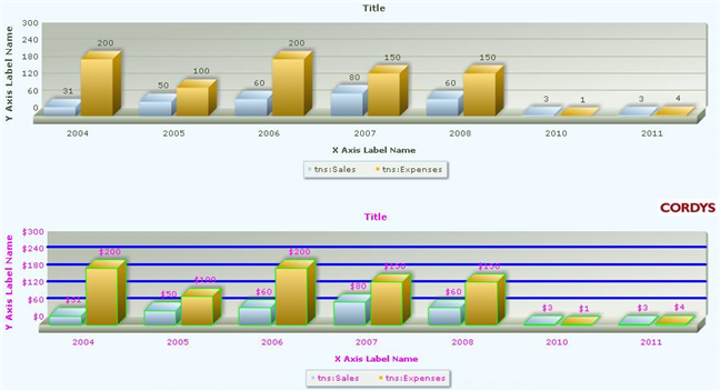
Table 2. List of Events
Event |
Description |
|---|---|
Data Click |
This event (ondataclick) is activated when you click a data plot. You can define the event logic on the Script tab of the XForm. |
Table 3. List of Methods
Method |
Description |
|---|---|
Registers the control to receive notifications for an event |
|
setDataColor(dataColor) |
Sets the color for each range in a chart. The colors are applied to consecutive ranges in the order defined in this method. For example, as depicted in the below example, the first range will display the first color (OOFFFF), the second range will display the second color (FFOOFF), and so on. If the ranges are in excess of the colors defined, the extra ranges will display default colors. chartObj.setDataColor(["00FFFF", "FF00FF", "FFFF00"]); Use the render() method to retrieve and display changes in the UI. |
setDataColorFromLabel(dataColorObject) |
Sets the color for each data plot in a chart based on the name of the label. chartObj.setDataColorFromLabel({"name1" : "00FFFF" ,"name2" : "FF00FF" ,"name3" : "FFFF00" } );
|
setChartData(data, bRefresh) |
Sets the data for the chart. The second parameter (bRefresh) is to delete the old data. If bRefresh is set to 'true', the old data is deleted and only the current data will render. If bRefresh is set to 'false', the current data is appended to the old data and rendered. The default value is 'false'. Use the render() method to retrieve and display changes in the UI. |
Unregisters the control to cease receiving notifications for its events |
|
render() |
Loads the chart with the latest updated properties. Use this method to ensure that the changes done using any of the 'set' methods are reflected in the UI. |
Causes an element to receive focus |
|
setLabelColumn(labelColumn) |
Sets the XPath reference of the label column in the business object. Data to be displayed on the label column is read from the business object based on the XPath specified. Use the render() method to retrieve and display changes in the UI. |
setValueColumn(valueColumn) |
Sets the XPath reference of the value columns in the business object. Data to be displayed on the value columns is read from the business object based on the XPath specified. Use the render() method to retrieve and display changes in the UI. |
getChartObject() |
Returns the fusion chart object. |
Table 4. List of Methods (for the Fusion Chart object)
You can use the APIs available on the base Fusion Chart object to further customize a chart. Use the getChartObject() method to retrieve the Fusion Chart object. The list of methods made available through the property sheet of the object are:
Method |
Description |
|---|---|
setProperty(xPath, propertyName, value,nameSpaceURI) |
Sets property value. This API provides more control on the chart to the user. Refer to Fusion Chart documentation for various properties and the corresponding values. * XPath: Required. XPath for the element in the chart object XML. Use "." as the XPath to set the properties on the root element.
|
For more information about the various chart types and examples of their formats, refer to the Fusion Charts and Fusion Widgets documentation.